Cornell University Cooperative Extension Website
My Role: Lead the creative direction and UI/UX responsive design for Extension public facing web presence.
Who is this website for?
The first thing that I needed to do was to help define the site audience. Who is this for? What purpose does it serve?
Discovery
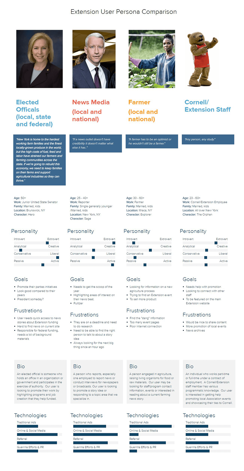
During the interview phase, we identified the following key audience members: Elected Officials, Media, Farmers, and Cornell/Extension employees.
Interviews
I conducted a range of interviews with stakeholders, co‐workers, and friends. This allowed me to gauge what people were saying about our website. I also utilized reports from Google Analytics to understand users' motivations for using the website.
Content Audit
Next, I conducted a content audit where I cross-referenced over 190 pages with our analytics data. The results of the audit found that the current site was not getting any returning visitors other than our content editor. This helped our team determine that the best scenario was to start fresh.
Taxonomies
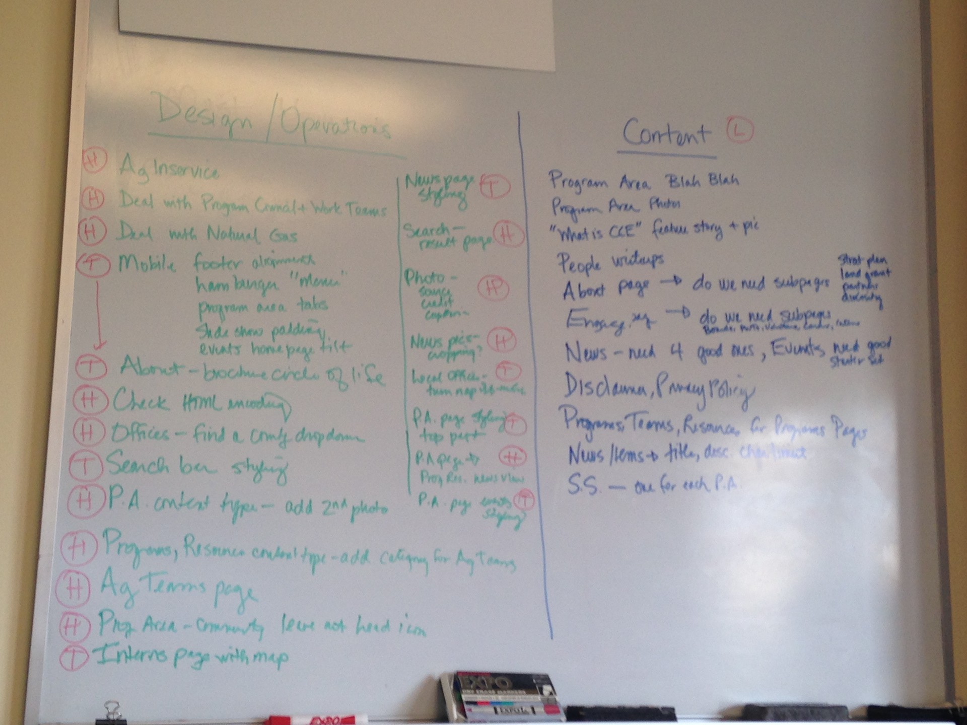
The next step was to define our new taxonomies for the public site. Working with our content editor and communications team, we defined our key mission mandates and developed sections by program area.
Prototype Phase, Iterate and Test!
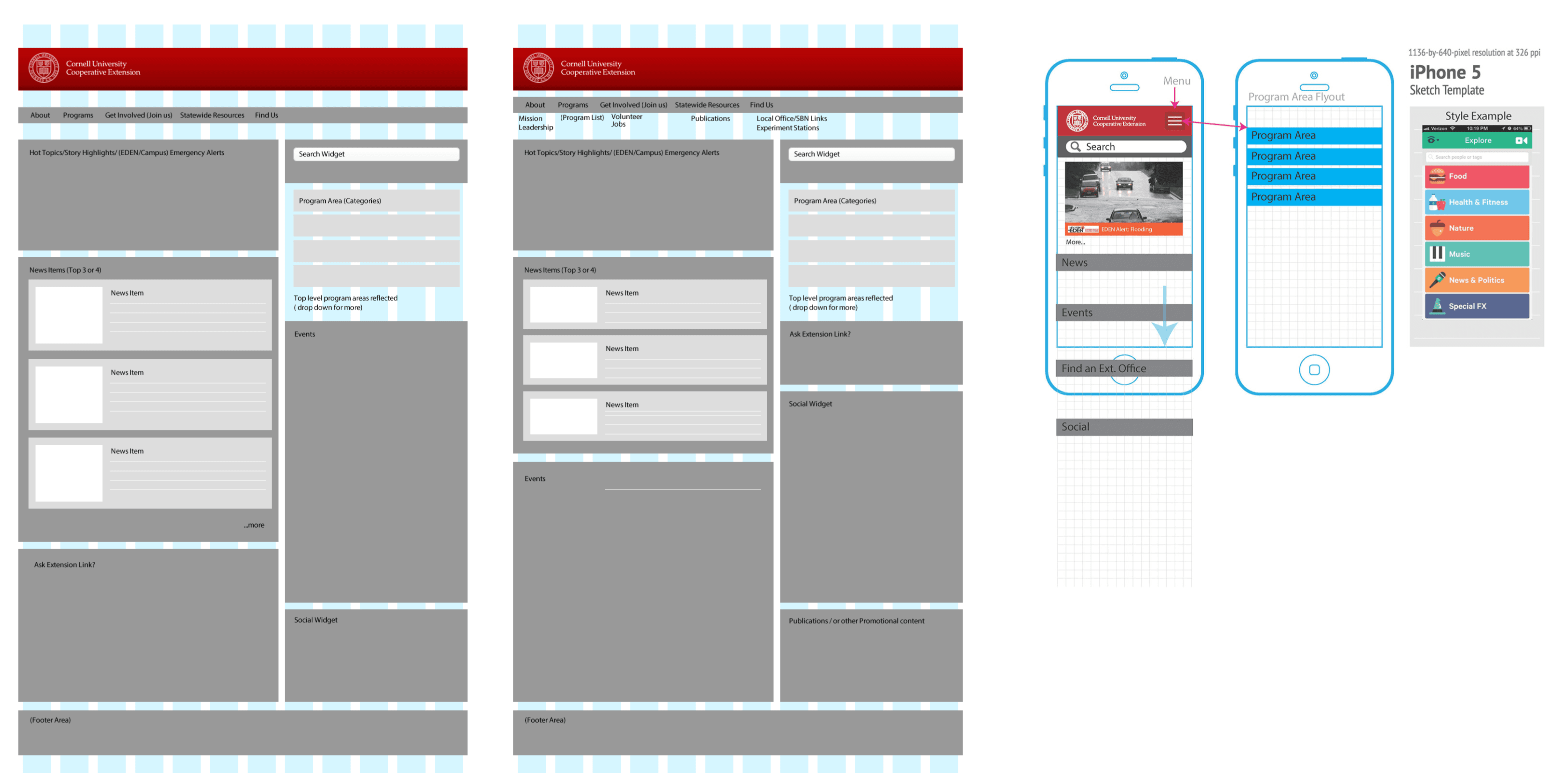
I quickly mocked up some potential designs in Sketch and we hit the ground running. With our initial prototypes, we found that the current base theme did not have reliable support. We ended up choosing a base theme with better responsive design tools, which enabled us to achieve our responsive goals faster.
Final Reveal
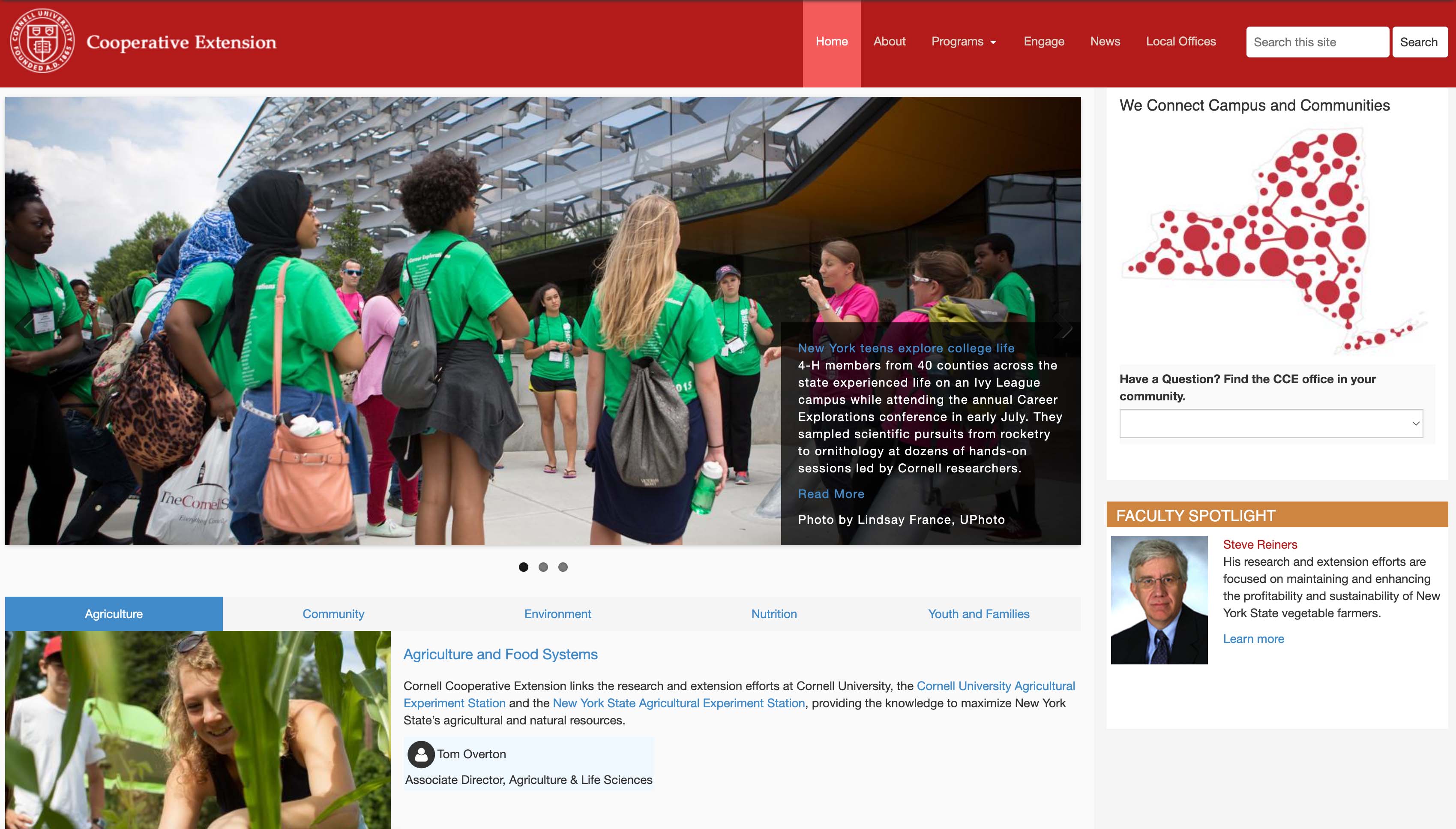
After much testing, the new website was soft-launched. Stakeholders had the opportunity to try out the new website and provide feedback on any issues they encountered. The reception we received about the new site was overwhelmingly positive.


